A Guide to Planning Data Analysis for Drone Operations
Trying to manage a drone operation without a solid data plan is a bit like flying blind. Real planning data analysis is what turns a mountain of raw flight logs and fleet stats into sharp, actionable intelligence. It's the only way to genuinely prove your value, lock down compliance, and actually boost the profitability of your drone program.
From Data Chaos to Operational Clarity
So many drone professionals—from solo pilots to enterprise fleet managers—are sitting on a goldmine of data they never touch. We're talking flight plans, battery cycle logs, airspace alerts, and pilot performance records, all scattered across different spreadsheets and forgotten folders. This is what I call "data chaos," and it makes seeing the big picture of your operational health completely impossible.
The fix isn't to become a data scientist overnight. It’s about building a simple, repeatable process to turn those numbers into decisions. With a structured workflow, you can shift from just reacting to problems to proactively planning your strategy, using your own history to predict future needs and squeeze more performance out of your fleet.
It's a continuous cycle of improvement that lifts your entire operation.
This simple workflow shows how to move from raw data collection to insightful visualization.
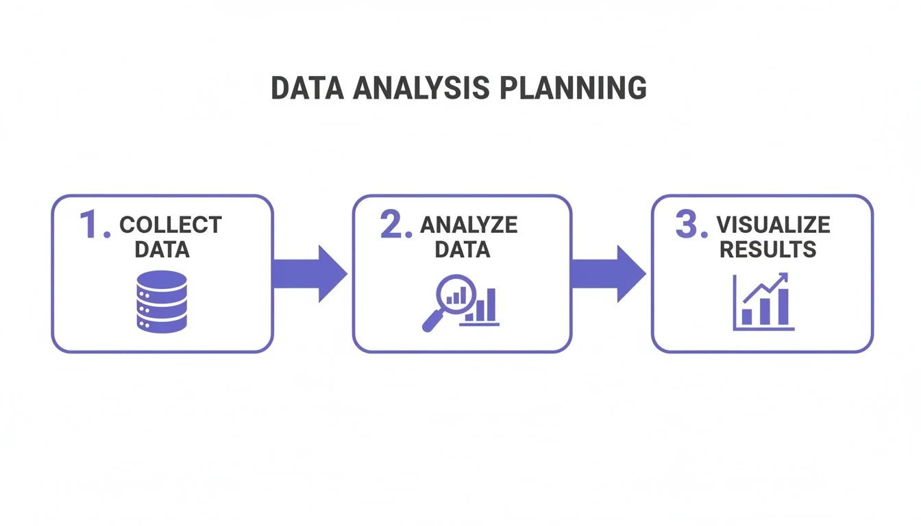
It’s all about systematically refining raw inputs into clear, actionable outputs that help you make better business decisions.
The 5 Stages of Drone Data Analysis
Here's a look at the core workflow that turns your messy data into a strategic asset. Each stage builds on the last, bringing you closer to true operational insight.
| Stage | Objective | Example Dronedesk Feature |
|---|---|---|
| 1. Collect | Gather all relevant operational data from multiple sources into a single location. | Automatic Flight Log Syncing |
| 2. Clean | Standardize formats, correct errors, and remove duplicates to ensure data accuracy. | Centralized Asset & Pilot Records |
| 3. Analyze | Identify trends, patterns, and anomalies to uncover key operational insights. | Fleet Utilization Dashboard |
| 4. Visualize | Present findings in an easy-to-understand format like charts and dashboards. | Proximity & Airspace Reporting |
| 5. Act | Use the insights to make informed decisions and implement operational improvements. | Exportable Compliance Reports |
This structured approach is the key to unlocking the real value hidden in your day-to-day operations.
Platforms like Dronedesk are designed to handle this entire lifecycle for you. By automatically pulling in flight logs and centralizing all your fleet information, they create a single source of truth. This completely removes the manual grunt work that stops most teams from even getting started.
When you embrace a data-driven mindset, you stop just completing jobs and start strategically managing an asset. You can finally answer critical questions like: Which drone is our most cost-effective? Are my pilots flying efficiently? Where are our biggest operational risks hiding?
This shift is more than just a nice-to-have; it's a competitive necessity. The drone market is booming, expected to jump from USD 73.06 billion in 2024 to USD 83.73 billion in 2025. In a market growing that fast, effective data analysis gives you a serious edge.
In fact, tools that simplify this process—like Dronedesk's real-time log syncing and proximity data analysis—have been shown to slash planning time by up to 40%. That's a direct boost to your bottom line. You can explore more about these market trends and how they impact operational efficiency.
Building Your Data Collection Workflow
Your analysis is only ever as good as the data you collect. It's that simple. A solid, reliable workflow is the absolute foundation of any effective planning data analysis strategy, making sure the information you gather is accurate, consistent, and complete. Without it, any insights you think you've found are built on shaky ground.

This whole process kicks off by figuring out which data points actually tell the story of your operations. It’s about much more than just flight time; it's about painting a holistic picture of your program's health and performance.
Defining Your Core Data Points
To get that complete picture, you need to think comprehensively. Go beyond the flight itself and consider the entire operational lifecycle. A good starting point is to focus on these critical categories:
- Flight Plans and Logs: This is your bread and butter. Capture detailed telemetry data, including locations, durations, altitudes, and any in-flight alerts or warnings. This is your primary source for performance analysis.
- Asset Management Data: Track everything about your hardware. I'm talking about drone maintenance schedules, battery charge cycles, and equipment repair history. This is how you predict failures and manage your asset lifespan.
- Pilot and Team Records: Keep pilot certifications, training records, and flight hour logs completely up to date. This is non-negotiable for compliance, but it also helps you spot who might need a bit more training.
- Project and Client Information: Don't let flights exist in a vacuum. Link them to specific jobs or clients so you can analyse profitability, see how resources are being allocated, and measure project efficiency over time.
Pulling these different data types together creates a rich, interconnected dataset. It lets you ask much smarter questions, like how a specific pilot's performance impacts the maintenance needs of a particular drone model on high-altitude survey jobs. You can find a deeper exploration of these concepts in our complete guide to effective drone data collection strategies.
The goal here is to build a "single source of truth." When all your operational data lives in one centralized system, you kill the guesswork and conflicting information that comes from juggling multiple spreadsheets and logbooks.
Automating Data Entry and Ensuring Quality
Let's be blunt: manual data entry is the biggest threat to your data's integrity. It's not just a time sink; it’s a magnet for human error. A forgotten log, a typo in a battery serial number, or inconsistent formatting can poison your entire dataset. This is exactly where automation becomes a game-changer.
Platforms like Dronedesk can sync directly with your drones to pull flight logs automatically, which pretty much eliminates manual entry. This guarantees every flight is recorded accurately and consistently without any extra work from your pilots. To get the most out of this, it helps to understand what workflow automation is and how it can streamline these critical but repetitive tasks.
Even with automation, you've got to stay vigilant about data quality. You need a plan to tackle common problems before they spiral out of control.
- Standardize Your Inputs: For any data that still has to be entered by hand, like pre-flight checklists or maintenance notes, create clear, mandatory procedures. Use dropdown menus instead of free-text fields wherever you can—it enforces consistency.
- Establish a Cleaning Routine: Set aside regular time to review your data for anything that looks off. Hunt for incomplete records, duplicate entries, or outliers that just don't make sense. A platform with a centralized dashboard makes spotting these issues a lot simpler than scanning endless spreadsheet rows.
- Implement Validation Rules: Use software features that flag incomplete or improperly formatted data right at the source. For example, a system can alert a pilot if they try to log a flight without assigning it to a specific project or drone.
By creating a structured and largely automated workflow, you ensure the data feeding your analysis is something you can actually trust. This turns data collection from a tedious chore into a powerful strategic asset for your entire drone operation.
Measuring What Matters with Drone Operations KPIs
Once you have clean, reliable data flowing in, you can start asking the right questions. This is where Key Performance Indicators (KPIs) come into play. They’re the specific, measurable metrics that cut through the noise and show you the true health and efficiency of your drone program. Frankly, just counting flight hours isn't enough; you need to dig deeper to understand your operation's real-world performance.
Think of KPIs as the tools that turn your raw data into a story. They tell you where you’re winning, where you’re falling short, and where your biggest opportunities for improvement are hiding.
Fleet Utilization Rate
One of the most powerful—and often overlooked—metrics is the Fleet Utilization Rate. This KPI tells you how much your drones are actually in the air versus sitting on a shelf collecting dust. It’s a direct measure of asset efficiency and is absolutely vital for making smart investment decisions.
The calculation is simple: (Total Flight Hours / Total Available Hours) x 100.
Imagine a surveying company with a high-end LiDAR drone. By tracking utilization, they might discover it’s only being used 15% of the time. This insight is gold. It could justify holding off on buying a second unit, or it might reveal a chance to market their LiDAR services to new clients, turning a costly asset into a fresh revenue stream.
Cost Per Flight Hour
Do you really know how much each flight costs your business? The Cost Per Flight Hour KPI is designed to answer that question. It breaks down all your expenses—from insurance and maintenance to pilot salaries and software subscriptions—and assigns them to each hour a drone is airborne. This is how you move from guessing your job profitability to knowing it with certainty.
The formula for this one is: (Total Operational Costs / Total Flight Hours).
An inspection team, for example, could use this metric to compare different drone models. They might find that while one drone had a lower purchase price, its frequent maintenance and shorter battery life lead to a much higher cost per flight hour. Suddenly, the more expensive model looks like the smarter long-term investment.
Tracking KPIs isn't just an accounting exercise; it's a strategic imperative. It's how you prove ROI, justify budgets, and make data-backed decisions that drive your operation forward. Without metrics, you're just flying on assumptions.
Success in drone operations isn't all that different from the financial markets; it relies on defining and diligently mastering performance metrics to guide your strategy.
To give you a starting point, here are some of the most critical KPIs drone programs should be tracking.
Essential Drone Operations KPIs
| KPI | What It Measures | Why It's Important |
|---|---|---|
| Fleet Utilization Rate | The percentage of time drones are in use versus available. | Identifies underused assets and informs purchasing decisions. |
| Cost Per Flight Hour | The total operational cost allocated to each hour of flight. | Reveals true job profitability and helps compare hardware TCO. |
| Incidents Per 100 Hours | The rate of safety incidents (e.g., hard landings, near misses). | Acts as a leading indicator for safety risks before major events occur. |
| Pilot Productivity | Average flight time or number of missions per pilot. | Highlights training needs and ensures operational consistency. |
| Mission Success Rate | The percentage of missions completed without data loss or re-flights. | Measures the reliability of your entire workflow, from planning to execution. |
These metrics provide a balanced view, helping you optimize not just for cost, but also for safety, reliability, and overall performance.
Pilot Productivity and Safety Metrics
Your pilots are your most valuable assets, and tracking their performance is key to a safe and efficient operation. This isn't about micromanagement; it's about spotting training opportunities and ensuring everyone is working to the same high standard.
Here are a few metrics to keep an eye on:
- Average Flight Time Per Pilot: This helps you understand pilot efficiency and can flag individuals who might need a refresher on mission planning or battery management.
- Incidents Per 100 Flight Hours: Tracking minor events, like hard landings or airspace alerts, gives you a leading indicator of potential safety issues before something serious happens.
- Compliance Score: This can be a simple score based on pre-flight risk assessment completion, accurate logbooks, and sticking to your standard operating procedures (SOPs).
These KPIs offer a well-rounded view of performance, blending efficiency with a crucial emphasis on safety and compliance. For a more detailed breakdown, check out our guide to the most impactful operational efficiency metrics for drone teams.
Turning Data into Decisions with Reports and Dashboards
Spreadsheets full of raw numbers don't tend to spark much excitement or action. The real magic happens when you take all that operational data you’ve collected and spin it into clear, compelling reports and dashboards. This is where the story of your drone program comes to life, turning complex metrics into something anyone can understand at a glance.
The point isn't just to show off data—it's to provide answers. Whether you're demonstrating the ROI of a project to a client, trying to justify a new equipment purchase to the leadership team, or handing over compliance docs to an auditor, your reports need to be instantly clear. Good visuals slice through the noise and get right to the heart of the matter.
It’s about moving past endless rows and columns and using visual tools that speak a universal language.
Choosing the Right Visual for Your Data
A great dashboard is all about picking the right chart for the job. Get this wrong, and you can actually hide the very insights you’re trying to showcase. It's like having a toolbox; you wouldn't use a hammer to turn a screw.
Here are a few practical examples for drone ops:
- Geospatial Maps: Nothing tells a location-based story better. You could create a flight map that color-codes routes by pilot, showing who covers which territories. Or, use a heatmap to pinpoint areas with frequent airspace alerts, instantly flagging operational hotspots.
- Bar Charts: Perfect for comparing different items. A bar chart is the best way to show fleet utilization, lining up the flight hours of each drone side-by-side. You’ll immediately see your workhorses and which assets are collecting dust.
- Pie or Donut Charts: Use these to show how different parts make up a whole. Analyzing project costs? A pie chart gives you a simple, at-a-glance breakdown of expenses like pilot time, equipment rental, and post-processing. It’s an easy way to see where the budget is going.
- Line Graphs: When you need to show a trend over time, a line graph is your best friend. Plot your Cost Per Flight Hour over the last 12 months. A steady downward trend is a powerful visual that proves your efficiency efforts are paying off.
Simple choices like these make your data far more approachable, transforming a dense report into a quick, digestible summary. For a deeper dive into designing these visuals, check out our detailed guide on creating business intelligence reports for drone operations.
A good dashboard answers questions before they are even asked. When a stakeholder looks at your report, they should immediately grasp the main takeaway without needing a lengthy explanation.
Building Your Essential Drone Operations Reports
With the right visuals in mind, you can start building specific, high-value reports that tackle key business questions. You don't need to be a data scientist to do this, either. Modern platforms like Dronedesk have built-in reporting tools that can generate these for you.
Here are three essential reports every drone program should be running:
- Monthly Operational Summary: This is your big-picture overview. It needs to include headline KPIs like total flight hours, number of missions completed, and the overall fleet utilization rate. It’s the perfect report to share with management for a consistent snapshot of the program's health and activity.
- Fleet Health Dashboard: This one is all about your hardware. It should visualize maintenance schedules, track battery cycle counts against their expected lifespan, and flag any drones with recurring technical issues. This gives you a proactive view, helping you spot potential failures before they happen and minimizing costly downtime.
- Project Profitability Report: This is where you connect your operations directly to the bottom line. For each project, this report should map out the total flight hours, all associated operational costs, and the revenue generated. It gives you a crystal-clear picture of which jobs are your most profitable, helping you sharpen your quoting process and focus your business development efforts.
These reports aren't just for record-keeping; they are active management tools. They give you the hard evidence you need to make smarter, strategic decisions that will improve safety, boost efficiency, and ultimately drive profitability for your entire operation.
Putting Your Drone Data Insights Into Practice
Collecting, cleaning, and visualizing your operational data is only half the battle. Honestly, it's the easier half. The real work—and where the value is truly unlocked—is turning those slick charts and KPIs into tangible action in the field. This is how you transform numbers on a screen into smarter, safer, and more profitable decisions.

Think about it: an insight without a corresponding action is just a piece of trivia. The whole point of this exercise is to spark meaningful change. It’s about forging a direct feedback loop where your operational history actively shapes your future strategy, creating a cycle of continuous improvement.
From Insight to Actionable Scenarios
Let's get out of the abstract and into the day-to-day. What does this actually look like for a drone team on the ground? It all comes down to connecting the dots between what the data is telling you and what you can physically change in your operations.
Here are a couple of real-world scenarios where data leads directly to improvements:
-
Scenario 1: The Battery Degradation Problem
- Insight: Your fleet health dashboard shows one specific drone model is burning through its battery life 20% faster than the rest of the fleet.
- Action Plan: You dig in and find these are the drones most often used on "hot swap" jobs, where batteries are slapped on the charger the second they land, still warm. You immediately update your Standard Operating Procedures (SOPs) to mandate a 30-minute cool-down period before charging. Boom—you’ve just extended the life of your expensive batteries.
-
Scenario 2: The "Inefficient" Pilot
- Insight: While looking at pilot productivity, you notice one pilot’s flight times are consistently 15-20% shorter than planned for similar missions.
- Action Plan: Instead of jumping to conclusions, you have a chat. Turns out, they're just being overly cautious with their battery's return-to-home settings. This isn't a performance issue; it's a coaching opportunity. You schedule a quick training session on advanced battery management, which boosts their efficiency and their confidence.
The goal is to treat every data point not as a final judgment, but as the beginning of a conversation. An anomaly isn't a failure; it's a flag that prompts you to ask "Why?" and then, "What can we do about it?"
Avoiding Common Data Analysis Pitfalls
As you go deeper down the data rabbit hole, a few common traps can easily derail your progress. Just being aware of them is the best way to stay on track. The two biggest culprits I see are analysis paralysis and a fixation on vanity metrics.
One of the most common challenges is "analysis paralysis," where you get so overwhelmed by the sheer volume of data that you fail to make any decision at all. The key is to stay laser-focused on the business questions you set out to answer in the first place.
The other major pitfall is chasing "vanity metrics." These are the numbers that look impressive but don't actually move the needle on business success. For example, celebrating a high number of total flights is pointless if your Cost Per Flight Hour is through the roof and projects are losing money.
To keep yourself honest, constantly ask these questions:
- Does this metric help me make a better decision?
- Is this insight directly tied to a business goal (like safety, profit, or efficiency)?
- What is the simplest action I can take based on this finding?
This simple framework helps you cut straight through the noise.
Creating a Simple Action Plan Framework
To make sure your brilliant findings don't just die in a meeting or get lost in an email chain, you need a simple, repeatable process for turning them into action. This doesn't need to be some complex, bureaucratic system. A basic framework can make all the difference.
- Isolate the Key Insight: State the single most important finding in plain English. For example, "We have a high number of airspace alerts in the downtown industrial park."
- Identify the Root Cause: Go find out why it's happening. Is it because of outdated mapping data, new construction, or a lack of pilot familiarity with the area?
- Propose a Specific Action: Define a clear, measurable next step. Something like, "Update pre-flight risk assessments for the industrial park to include a mandatory check for temporary crane activity."
- Assign Ownership and a Deadline: Make someone responsible for getting it done and give them a timeline. "The Chief Pilot will update the SOPs by this Friday."
- Measure the Impact: After the change is made, go back to your data. "Review airspace alert data for the next 30 days to confirm the new procedure is actually reducing alerts."
This structured approach ensures your planning data analysis efforts don't just produce interesting reports—they create a safer, more efficient, and more profitable drone operation. It’s the final, essential step that makes this entire process worthwhile.
Common Questions About Drone Data Analysis
Getting into a structured data analysis routine can feel like a huge task. I get it. Many operators, especially those just starting to grow their business, have a ton of practical questions about where to even begin and what's actually worth tracking. Let's tackle some of the most common concerns head-on with some straight, actionable answers to get you over those first few hurdles.
How Much Data Do I Really Need to Start Analyzing My Drone Operations?
This is probably the number one question we hear, and the answer is way simpler than you'd think: you can start with your very first flight. The biggest myth out there is that you need a massive, historical dataset to find anything useful. That’s just not true.
The real key isn't the volume of data—it’s consistency. If you capture the right data points from day one and do it consistently for every single mission, you're building a valuable dataset right away. Each new job adds another layer of context, allowing trends to pop out over time, even with a small fleet.
Think of it like this:
- Your first flight sets a baseline for a specific mission type. What's normal?
- By your 10th flight, you can start comparing pilot performance or see how battery life holds up in different weather.
- Once you hit 50 flights, you've got enough solid data to accurately figure out your Cost Per Flight Hour and pinpoint which services are actually making you the most money.
The trick is having a system that makes this collection painless from the get-go. A platform like Dronedesk automates things like flight log syncing, so this crucial data is captured without you lifting a finger. You end up building a rich operational history without even thinking about it, making sure every single flight contributes to your future insights.
What Are the Most Important Metrics for a Solo Operator?
When you're flying solo, every minute and every pound counts. You don’t have the luxury of tracking dozens of vanity metrics. Your focus has to be laser-sharp on the KPIs that directly affect your bottom line and whether your business will be around next year. Forget the complex enterprise dashboards for a minute and nail these three:
- Cost Per Job: This is so much more than just flight time. You need to tally up everything for a project—travel, your insurance allocation, software subscriptions, and your own time. This number tells you how profitable each gig truly is and is absolutely critical for quoting new work accurately.
- Client Project Hours: Track every single minute you spend on a client, from the initial phone call and flight planning to being on-site and then processing the data back at the office. This helps you spot which clients are the most efficient to work with and where you might be getting killed by "scope creep."
- Equipment ROI: As a solo op, every drone, sensor, or piece of software is a major investment. Track how many billable hours each piece of gear generates. This data is your hard proof when you're trying to decide whether it's time to upgrade a drone or invest in a new capability.
For the solo professional, data analysis isn’t about managing a giant fleet; it's about validating your entire business model. These metrics give you the cold, hard evidence you need to price your services right, manage your time, and grow your business with confidence.
How Can I Convince My Team to Adopt a Data-Driven Approach?
Getting your team on board with a new, data-focused way of working is less about the tech and all about the people. Pushback usually comes from a fear of being micromanaged or buried in more admin. The secret to winning them over is to focus relentlessly on the "what's in it for them" angle.
You need to frame this shift not as a top-down mandate, but as a way to make their jobs easier, safer, and more professional.
Show them how:
- Automated logging saves them time. Instead of spending 20 minutes filling out paperwork after a long day in the field, a system like Dronedesk can do it for them automatically. That’s time they get back in their day.
- Fleet data prevents failures. Tracking battery cycles and maintenance isn't about checking boxes for management. It's about spotting a potential equipment failure before it happens mid-flight, which prevents a costly or dangerous incident.
- Performance metrics get them better resources. Analyzing flight data might reveal the need for better training or new gear. It provides the objective evidence you need to justify the budget for things that directly help the team succeed in the field.
When you can clearly show how a data-driven approach cuts down their admin load and makes them safer, it stops being a management chore and becomes a valuable tool that supports their success.
Ready to turn your scattered flight logs into a powerful strategic asset? Dronedesk gives you the end-to-end platform to automate your data collection, track what actually matters, and generate the reports you need to grow your operation. Start your free trial today and see the difference for yourself at https://dronedesk.io.
 Drone Near Airport Rules Explained for Safer Planning →
 International Drone Regulations Every Global Team Should Know →
 Drone Flight Risk Assessment Example for Safer Missions →
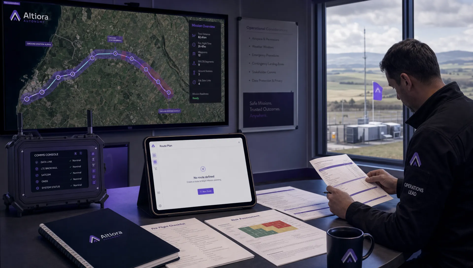 Beyond Visual Line of Sight Explained for Operators →
 How BVLOS Drone Operations Change Commercial Workflows →
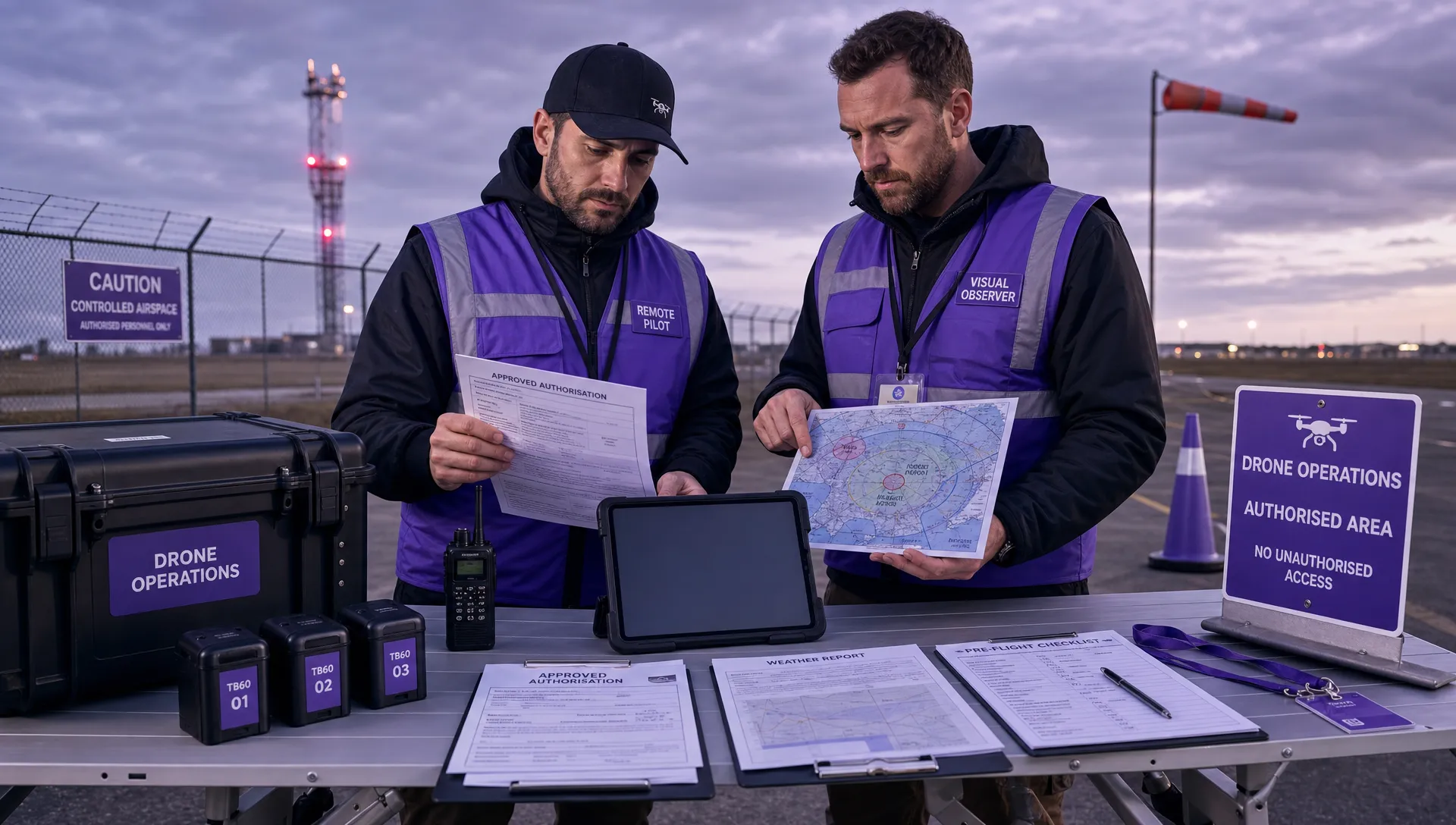 FAA Drone Rules Every Commercial Pilot Should Know →
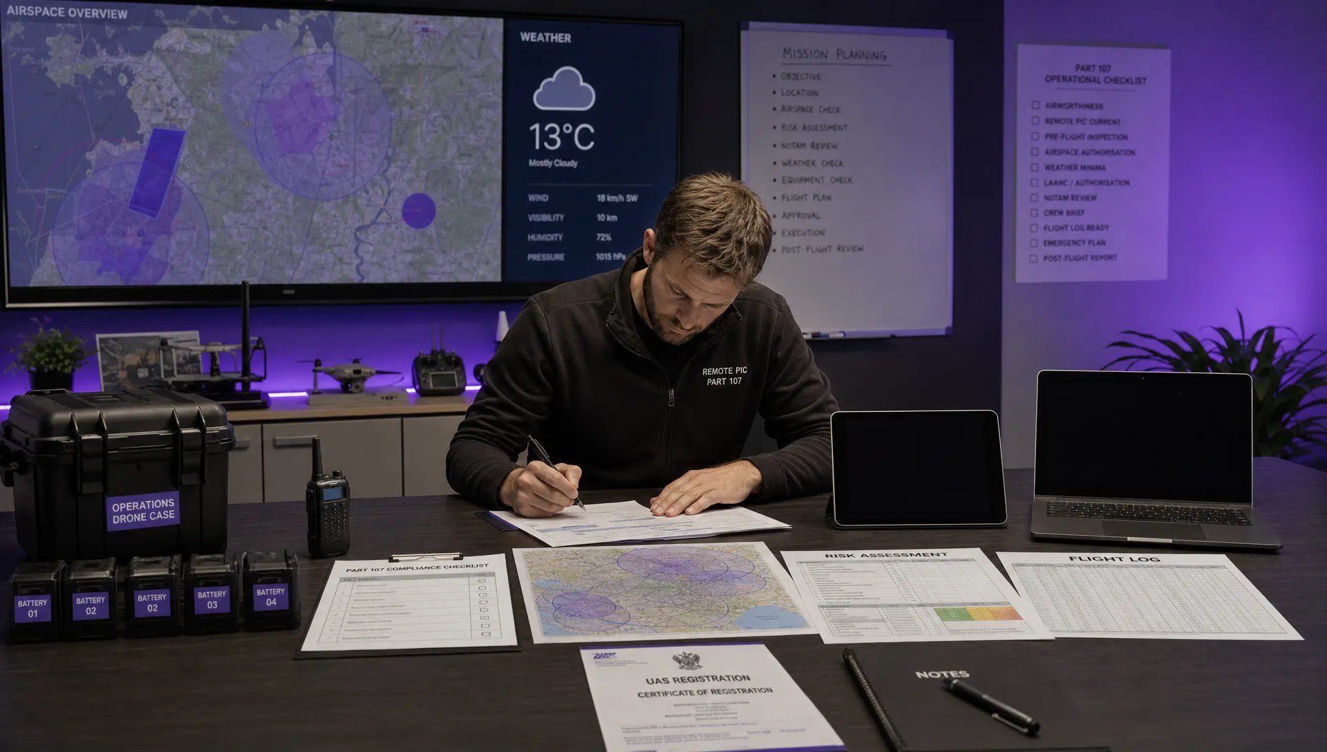 FAA 107 Explained for Commercial Drone Operators →
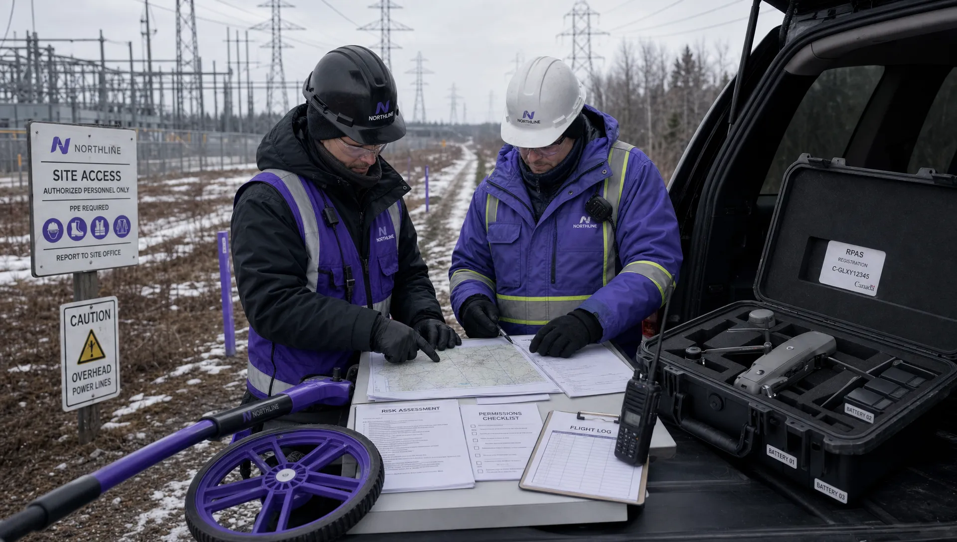 Canadian Drone Regulations Explained for Business Use →
 FAA Part 107 Drone License Explained for Beginners →
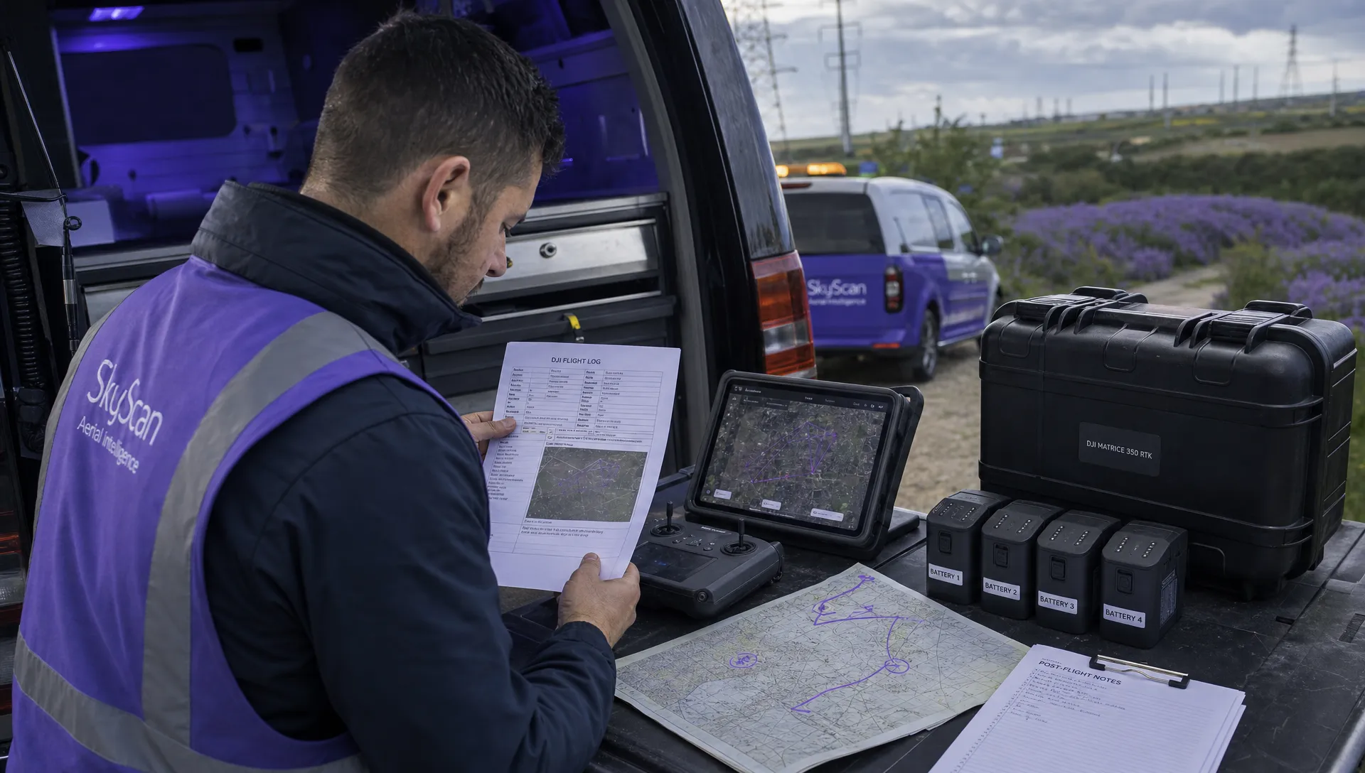 How to Review a DJI Drone Flight Log Step by Step →