How to Read Aeronautical Charts for Drone Pilots
Learning to read an aeronautical chart is like learning a new language. You're translating a dense map of lines, colors, and symbols into a clear, three-dimensional picture of the sky above you. It's how you see airspace boundaries, spot potential hazards, and ultimately, know exactly where you can and can't fly your drone. This skill is your ticket to safe and compliant flights, period.
Why Aeronautical Charts Are Essential for Drone Pilots
For a drone pilot, a sectional chart is much more than just a map—it's your tool for seeing the invisible. Without it, you're flying blind to things like high-traffic flight paths, restricted zones, and sudden changes in airspace that could put your drone, and more importantly, manned aircraft, at serious risk. Getting comfortable with these charts is the foundation of any professional drone operation.
Let's paint a picture. Imagine you land a gig that looks simple on Google Maps—photographing a property near what seems to be a small, quiet airstrip. A quick look at an aeronautical chart tells a completely different story. You'd immediately see the airport's traffic pattern, its communication frequency, and the very real potential for low-flying aircraft. That knowledge changes your entire flight plan from "go fly" to "plan, coordinate, and fly with extreme caution," preventing a dangerous encounter.
From Paper Strips to Digital Screens
The charts we rely on today have been refined over a century. They have a rich history and were absolutely central to the evolution of navigation from the earliest days of aviation. The U.S. Library of Congress actually has an incredible collection of these, including early "strip maps" from the 1920s that guided pilots along specific routes. These were the original GPS, developed nearly 70 years before GPS technology became a household name.
This long evolution from simple paper maps to the complex digital resources we use now underscores just how important they are. Every single symbol, line, and color is there for a reason, backed by decades of aviation experience and, unfortunately, lessons learned the hard way.
For drone pilots, understanding airspace isn't just about following rules. It's about protecting your expensive equipment, your business reputation, and the safety of the entire National Airspace System. A chart gives you the situational awareness you need to make smart, informed decisions on the fly.
Practical Applications in Modern Drone Work
Knowing how to read these charts directly impacts your bottom line. Being able to confidently navigate complex airspace is what separates amateurs from pros, especially for jobs in congested areas. It's a vital skill for anyone looking to leverage the many benefits of drone photography for clients in real estate or commercial development.
Think about these real-world scenarios where chart knowledge is completely non-negotiable:
- Skydiving Zones: You see a tiny parachute symbol on your chart. That's a skydiving drop zone. Flying your drone there without explicit coordination could lead to a catastrophic collision. The chart gives you the heads-up you need to stay clear.
- Military Operations Areas (MOAs): These zones, marked with magenta hatched lines, are where military aircraft practice high-speed training exercises. Charts tell you the active times and altitudes, allowing you to avoid them entirely and prevent becoming a very small, very expensive bug on a fighter jet's windshield.
- Stadium TFRs: Temporary Flight Restrictions (TFRs) pop up all the time around major sporting events. While they are officially published via NOTAMs, stadiums are clearly marked on charts, giving you a clue that you'll need to check for restrictions before flying anywhere nearby on game day.
Decoding the Most Important Chart Symbols
Think of the chart legend as your visual dictionary for the sky. Learning how to read aeronautical charts is like becoming fluent in a symbolic language where every little icon tells a critical story. This isn't your average road map; it's a language developed over decades specifically for aviation's unique needs.

Early aviators quickly figured out that ground-based maps just didn't cut it. For someone navigating from the air, features like railways were far more useful for getting their bearings than individual roads. This is why you'll see certain features emphasized on charts today, reflecting a long history of practical, real-world refinement. If you're curious about the evolution, this insightful GIS analysis digs into how these tools developed.
Airport Symbols Explained
The symbols you'll see most often are for airports. Their color and shape give you a vital snapshot of what's happening on the ground.
- Blue Airport Icons: These airports have a control tower. Flying anywhere near them means you're in controlled airspace and will need to do more planning, likely requiring authorization.
- Magenta Airport Icons: These are non-towered airports. While they might be less busy, you still have to be incredibly vigilant. Manned aircraft pilots are coordinating with each other directly, so situational awareness is everything.
The shape of the icon tells you about the runway. A simple circle means the runway is less than 8,069 feet. A more complex, runway-like shape indicates a longer runway, which usually means larger, faster aircraft are operating there.
Pro Tip: Keep an eye out for a small star symbol above an airport icon. This tells you a rotating beacon is present, which operates from sunset to sunrise. It’s a small detail, but a useful one for orientation if you're planning any night flights.
Navigation and Communication Aids
While drone pilots don't navigate using VORs (VHF Omnidirectional Range) like manned aircraft, seeing them on a chart is still a big deal. They often mark the center of busy airspace corridors or the intersection of Victor airways—basically, highways in the sky. Their presence signals a high-traffic area.
Frequencies listed near airports are another key piece of information. The CT (Control Tower) frequency is what pilots use to talk to air traffic control. You won't be using a radio, but knowing that frequency is there tells you it's an active, controlled environment that demands your full attention.
Identifying Special Use Airspace
Special Use Airspace (SUA) symbols are absolutely critical for drone pilots to recognize and, in most cases, avoid. These areas have serious restrictions you must respect.
- Prohibited Areas (P-###): You'll see these marked with a solid blue hatched line and a "P" followed by a number. Flight is completely banned here, usually for national security reasons. No exceptions.
- Restricted Areas (R-###): Also marked with a blue hatched line but with an "R." Flight is restricted because of hazardous activities, like live-fire military exercises. You can't enter without explicit permission from the controlling agency.
- Military Operations Areas (MOA): These are outlined with a magenta hatched line. This is where military aircraft conduct training, which can involve high speeds and abrupt, unpredictable maneuvers. Flying in an active MOA is extremely dangerous.
Getting these symbols down is fundamental for both safety and compliance. This knowledge also ties directly into newer regulations. The data broadcast by your drone helps authorities see your position in relation to these charted areas. To get up to speed on the tech, check out our guide on what Remote ID for drones is and why it's so important.
Aeronautical chart symbols can feel overwhelming at first, but focusing on the most common ones will quickly build your confidence. Here's a quick-reference table covering the essentials you'll encounter most often as a drone pilot.
Essential Aeronautical Chart Symbols for Drone Pilots
| Symbol Type | Visual Example | Meaning | Relevance for Drone Pilots |
|---|---|---|---|
| Airport (Controlled) | A blue circle, or a blue icon shaped like runways. | Airport with an operating control tower. | Indicates you're near controlled airspace (Class B, C, or D). Authorization is almost always required to fly here. |
| Airport (Uncontrolled) | A magenta circle, or a magenta icon shaped like runways. | Airport without an operating control tower. | Manned aircraft are still present but coordinate among themselves. Heightened vigilance is required to avoid conflicts. |
| Obstruction | A small, black triangle-like symbol, often with numbers next to it. | A tall structure like a tower, antenna, or building. | A critical physical hazard to avoid. The numbers indicate the height above sea level (MSL) and in parentheses, above ground (AGL). |
| Special Use Airspace | Hatched lines in blue (Prohibited/Restricted) or magenta (Military Operations). | Areas with flight restrictions due to national security or hazardous activity. | These are no-fly or fly-with-extreme-caution zones. You must understand the specific rules for each SUA before flying nearby. |
| VHF Omni-Range (VOR) | A hexagon, often with a compass rose around it. | A ground-based radio navigation aid for manned aircraft. | While not used by drones for navigation, VORs often mark the center of busy airspace and high-traffic aerial intersections. |
Think of this table as your cheat sheet. When you're reviewing a chart for a pre-flight plan, having these key symbols memorized will help you spot potential hazards and operational constraints in seconds.
Mastering Airspace Classes on Your Sectional Chart
Of all the skills you need to learn how to read aeronautical charts, understanding airspace is without a doubt the most important. These invisible, three-dimensional zones are what dictate where you can legally and safely fly your drone. It helps to think of them not as restrictions, but as a structured highway system for the sky that keeps everyone—from a 747 to your Mavic—from bumping into each other.

Each class of airspace shows up differently on a sectional chart, and being able to spot them instantly is absolutely crucial. Let’s walk through the most common ones you’ll run into.
Class B: The Busiest Airspace
You'll find Class B airspace, marked by solid blue lines, wrapped around the nation's busiest airports. Think about the airspace over major international hubs like LAX, JFK, or Heathrow—that's Class B. It's often structured like an upside-down wedding cake, with multiple layers that get wider the higher you go.
When you see these solid blue circles, know this: you need explicit authorization from Air Traffic Control (ATC) to fly your drone inside, no matter how low you are. For drone pilots, this almost always means applying for clearance through the FAA’s LAANC (Low Altitude Authorization and Notification Capability) system. No exceptions.
Class C and D: Controlled Airspace
Class C and D airspace are also controlled, but they typically surround airports with less traffic than the major Class B hubs. They still require your full attention.
- Class C Airspace: This is marked with solid magenta lines. It also has that layered, wedding-cake structure but is smaller in scale than Class B. You'll still need LAANC authorization to fly here.
- Class D Airspace: This is shown by a dashed blue line, usually forming a single circle around an airport. This controlled airspace typically goes from the surface up to 2,500 feet Above Ground Level (AGL). And yes, LAANC is required here, too.
A great way to get your head around these zones is to stop seeing just lines on a map and start imagining the 3D space they represent. This mental model is the key to true situational awareness, a topic we explore in more detail when understanding the key types of FAA airspace classifications.
Interpreting Airspace Altitudes
A common sticking point for new pilots is figuring out the altitude numbers written next to these airspace boundaries. You'll frequently see a fraction, like 100/40. This is the chart's shorthand for telling you the vertical limits of that particular airspace segment.
- The top number (100) is the ceiling, or the upper limit.
- The bottom number (40) is the floor, or the lower limit.
These figures represent hundreds of feet above Mean Sea Level (MSL). So, a marking of 100/40 means that piece of sky starts at 4,000 feet MSL and stops at 10,000 feet MSL. If you see SFC, that simply means the airspace starts right at the surface.
Class E and G: The Most Common Zones
Finally, we have Class E and G, which cover the vast majority of the country and are where you'll likely spend a lot of your flying time.
- Class E (Controlled): This is essentially the default controlled airspace. It often begins at 700 feet AGL (marked by a fuzzy, feathered magenta line) or 1,200 feet AGL (marked by a fuzzy blue line). Below these floors, you're usually in Class G.
- Class G (Uncontrolled): This is the good stuff. It's airspace where you generally don't need LAANC authorization to fly, as long as you stay below 400 feet AGL and follow all other Part 107 rules. It exists from the surface right up to the floor of the controlled airspace above it.
Let's make this practical. Say you're planning a flight just outside a town. You spot a fuzzy magenta line on your chart. That tells you that the airspace becomes controlled Class E at 700 feet AGL. As long as your mission keeps your drone below that altitude (while also staying under the 400-foot Part 107 ceiling), you're operating in uncontrolled Class G airspace. No LAANC needed.
This simple observation is a perfect example of how chart literacy directly informs your flight plan and keeps you compliant. It’s that easy.
Identifying Obstacles and Terrain Features
Flying safely is as much about dodging things you can see as it is about navigating airspace you can't. While airspace classes tell you the rules of the sky, the ground itself—with its hills, towers, and windmills—sets the physical boundaries for your flight. Getting a handle on how to spot these features on an aeronautical chart is a core skill for any pilot. It's what keeps you from turning an expensive drone into a pile of plastic.

This is where we shift our focus from the invisible lines in the sky to the very real objects on the ground. You’re looking for anything your drone could physically hit. Luckily, these are all clearly marked to keep all aircraft, both crewed and uncrewed, safely away from them.
Spotting Man-Made Obstructions
The most common hazards you’ll come across are man-made towers. On a sectional chart, they show up as little symbols that look like tiny Eiffel Towers. Right next to that symbol, you’ll find two critical numbers.
- The first number, without parentheses, is the height of the obstacle's top in Mean Sea Level (MSL).
- The second number, tucked inside parentheses, is its height in Above Ground Level (AGL).
Let's say you spot a tower symbol with 1420 (410) next to it. That tells you the very top of that tower is 1,420 feet above sea level, but it only stands 410 feet tall from its base on the ground. As a drone pilot, that AGL number is your bread and butter, since all your altitude restrictions are based on the ground directly below your drone.
You might also see clusters of these symbols, which usually indicates something like a wind farm. Treat these areas with extreme caution. Flying through a field of massive, spinning blades without a solid plan is a recipe for disaster.
Understanding Terrain and Elevation
Beyond just the towers, the chart gives you a great overview of the landscape's elevation. The background colors are your first clue—greens for lower spots, shifting to browns for higher terrain. It gives you a quick visual feel for the lay of the land.
But for precision, you need to find the Maximum Elevation Figure (MEF).
The MEF is that big, bold number you see in the middle of each grid square on the chart (the squares formed by lines of latitude and longitude). This number represents the absolute highest point within that specific grid, rounded up to the nearest 100 feet.
Think of the MEF as your ultimate safety buffer for terrain clearance. It accounts for everything—the highest natural ground and any man-made obstacles in that grid. So, if the MEF in your flight area is 2,400 feet, you can be confident that staying below your 400-foot AGL ceiling will keep you well clear of any charted ground-based threats in that entire area.
A Real-World Drone Flight Planning Walkthrough
Theory is one thing, but applying what you know about reading aeronautical charts to a real-world flight is where it all clicks. So, let's walk through a practical scenario to turn these concepts into a repeatable workflow you can use for every single mission.
Picture this: you've been hired to do an aerial inspection of a big communication tower. The site is just outside a town with a regional airport. This isn't a simple point-and-fly job; it demands a solid chart review to make sure you're operating safely and legally.
Interestingly, the charts we use today have their roots in WWII, when the need for reliable aerial navigation exploded. By 1943, chart production skyrocketed from 500,000 to over 11 million a year. That surge led to the standardized, info-packed maps we rely on. You can discover more about this fascinating history on ESRI.com.
Initial Chart Analysis
First things first, pull up the sectional chart for the area. Your eyes should immediately scan for the big-picture items.
You spot the town's airport circled by a dashed blue line. That’s an instant identification of Class D airspace. Right away, you know LAANC authorization is a must if any part of your flight path crosses into that circle.
Next, you pinpoint your target: the communication tower, marked with its distinct symbol. Next to it, you read the numbers 1850 (820). This tells you the tower's peak is 1,850 feet MSL, and it stands a whopping 820 feet AGL. Your flight will be well below the top, but it's a critical reminder that a major hazard is right there on-site.
Identifying Potential Conflicts
Zooming out a bit, your eyes catch an area marked with magenta hatched lines a few miles to the east—that’s a Military Operations Area (MOA). Time to dig into the details.
You check the chart's margin notes and see the MOA is active on weekdays from 0800 to 1700 local time, up to 10,000 feet MSL. Your flight is scheduled for Wednesday at 1000. So, while you're not flying in the MOA, you've just raised your situational awareness. High-speed military traffic could be in the vicinity.
This whole process is a simple, repeatable workflow you can visualize for any pre-flight chart analysis.

Breaking down a complex task into a simple three-stage process ensures you cover all your bases, from picking the right chart to plotting a safe course.
For one final check, you look at the Maximum Elevation Figure (MEF) for the grid square your site is in. It reads 21. This means the highest point in that entire quadrant is 2,100 feet MSL.
Mission Plan Takeaway: Based on this quick analysis, your flight plan is taking shape. You'll be operating in Class G airspace, making sure to stay well clear of the Class D boundary. You'll need to keep a sharp lookout for military aircraft, and you’ll set your drone's maximum altitude to 400 feet AGL. This keeps you safely below the tower's peak and well within FAA limits.
Got Questions? We've Got Answers
Even when you feel like you're getting the hang of aeronautical charts, some practical questions always seem to pop up. Don't worry, that's completely normal. Let's walk through a few of the most common sticking points for drone pilots so you can head out on your next job with total confidence.
One of the first hurdles is just making sure you're looking at the right information. Flying with an outdated chart isn't a small mistake—it's a massive safety risk. Airspace boundaries, frequencies, and obstacles can, and do, change.
How Often Are Charts Updated?
The FAA updates aeronautical charts on a strict 56-day cycle. You should always check the effective and expiration dates, which are printed clearly right in the chart's margin.
Honestly, the easiest way to stay current is to use a digital source. The FAA's website or dedicated aviation apps will automatically serve up the latest versions. Flying with an expired chart is more than just bad practice; it's a dangerous gamble.
AGL vs. MSL: What's the Difference?
Another point of confusion is the different altitude measurements you'll see. Getting this right is fundamental for staying legal and avoiding obstacles.
- AGL (Above Ground Level): This is exactly what it sounds like—an object's height relative to the ground directly beneath it. Your drone's maximum 400-foot ceiling is measured in AGL.
- MSL (Mean Sea Level): This is an object's altitude relative to the average sea level. It’s the main reference point used by manned aircraft.
On a chart, you might see an obstacle marked as 1420 (410). This tells you its peak is 1,420 feet MSL, but it only stands 410 feet AGL. As a drone pilot, you need to lock your focus on that AGL number to make sure you have safe clearance.
Can I just use Google Maps instead? Absolutely not. While it's brilliant for finding your way on the ground, Google Maps has zero information about airspace classes, restricted zones, or any of the other critical aviation data you need. Using it for flight planning leaves you completely blind to the rules of the sky.
Finally, just managing all this information—from chart analysis before the flight to logging everything afterward—can be a real juggling act. Continuously tracking your operations is just as vital as your pre-flight checks. You can learn more about the benefits by reading our guide to flight data monitoring for professional pilots. Proper monitoring builds a solid safety record and ensures you stay compliant, turning all that raw flight data into genuinely useful insights.
Flight planning is so much more than just reading a chart. Dronedesk pulls all your mission-critical details—from airspace intelligence and risk assessments to flight logs and client management—into one seamless platform. Simplify your workflow and fly safer by visiting https://dronedesk.io to see how it works.
 Top 10 Free Drone Mapping Software for 2026 →
 Recurrent Training for Pilots: Master Drone Operations →
 Crash Data Group: Drone Pilot Incident Guide →
 The Commercial Drone Alliance: Your Pilot's Guide →
 Air Data Computer: The Drone Pilot's Essential Guide →
 Reliable Jet Maintenance: Drone Fleet Guide →
 Best Software for Drone Operations in 2026 →
 Mastering Drone Services Pricing: 2026 Guide →
 Drone Deploy App: Master Features & Alternatives →
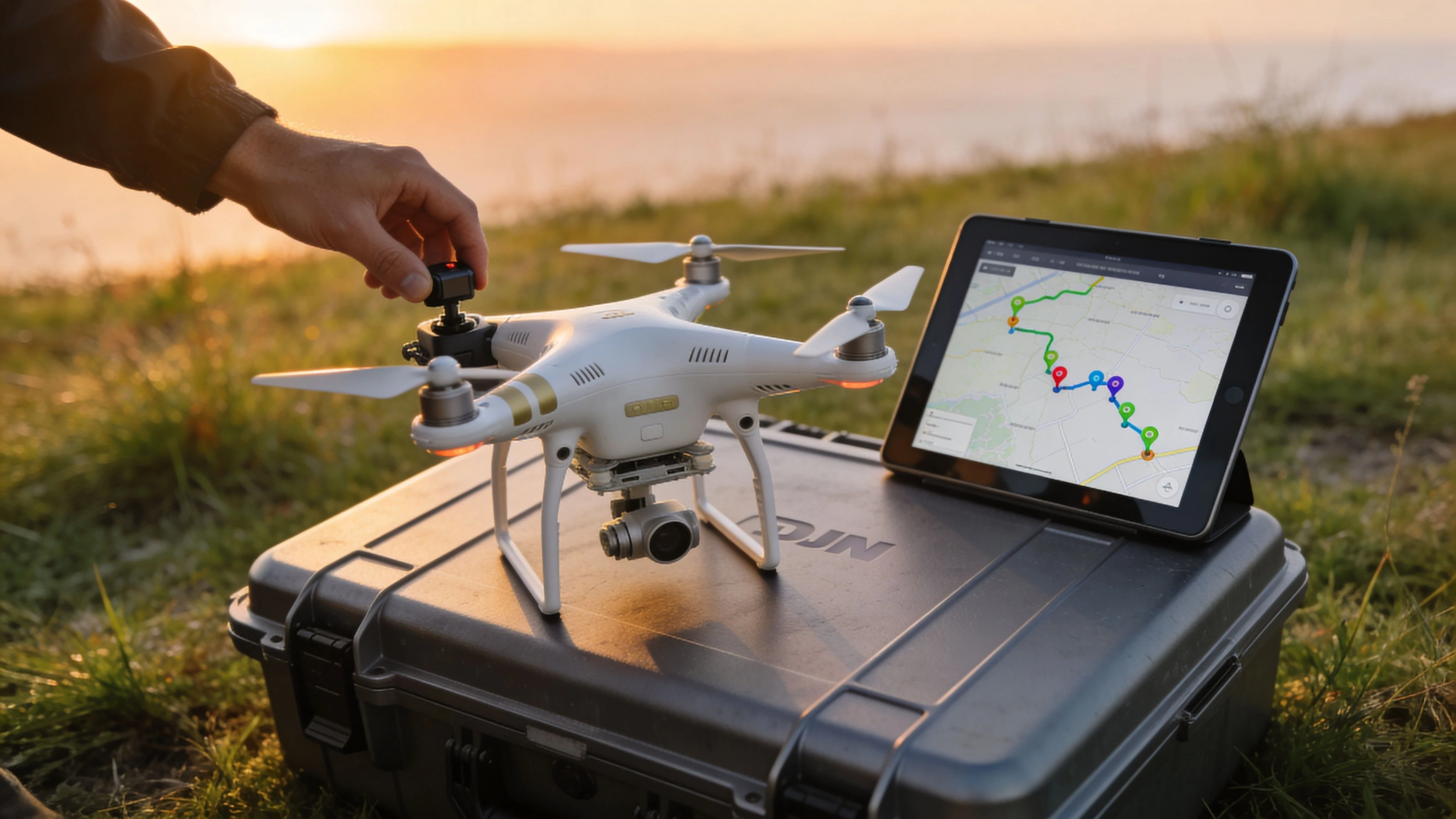 DJI Phantom 3 Adv: 2026 Guide & Pro Workflow →