How to Read Sectional Charts for Drone Flights
When you unfold a sectional chart for the first time, it can feel like you’re staring at a map of an alien world. It’s a dense web of lines, colors, and strange symbols, but trust me, every single mark has a purpose. It's all telling a story about the sky and the ground below it.
Think of it as your number one tool for pre-flight risk assessment. It helps you build a detailed, three-dimensional picture of your operational area before your drone’s props even start spinning.

These charts are anything but a modern invention. The history of sectional charts actually dates back to the early 20th century, evolving right alongside aviation technology itself. One of the earliest known aeronautical charts from 1912, created by Karl Peucker, was a bit of a free-for-all, commissioned by European aero clubs and lacking any standardized symbols.
It was Charles Lindbergh’s legendary 1927 transatlantic flight that really helped popularize their use in the United States. If you're a history buff, you can dive deeper into the development of early aeronautical charts on AOPA.org.
To help you get started, let's break down the most essential pieces of a sectional chart and what they mean for you as a drone pilot.
Key Sectional Chart Elements at a Glance
This table provides a quick reference to the five most critical components you'll find on a sectional chart, explaining their purpose and importance for drone pilots.
| Chart Element | What It Represents | Why It Matters for Drones |
|---|---|---|
| Chart Legend | The "dictionary" of the chart, explaining every symbol, line, and color. | This is your starting point. Without it, you’re just guessing what the markings mean. It’s essential for accurately identifying risks. |
| Airspace Boundaries | Lines (solid blue, magenta, dashed) that delineate different classes of airspace (e.g., Class B, C, D, E). | Flying in the wrong airspace without authorization is a serious violation. This shows you exactly where you need to be extra cautious or get LAANC approval. |
| Terrain Elevation | Contour lines and color tints that show the height of the ground above sea level. | Crucial for maintaining a safe altitude above ground level (AGL) and avoiding collisions with hills or mountains, especially in unfamiliar territory. |
| Ground Obstacles | Symbols for towers, windmills, buildings, and other tall structures. | These are physical hazards your drone could hit. The chart tells you their location and height, which is non-negotiable information for flight planning. |
| Airports | Symbols that indicate the location and type of airports, from international hubs to small private strips. | Airports are high-traffic areas for manned aircraft. Knowing where they are helps you maintain situational awareness and stay clear of approach/departure paths. |
Getting comfortable with these five elements will give you a solid foundation for reading any sectional chart and planning safer, more compliant drone flights.
Your Starting Point: The Chart Legend
Before you even think about finding your flight location, your first stop has to be the chart legend. This is your Rosetta Stone, the key that unlocks everything else on the map. You'll usually find it on a side panel of a printed chart, or it’s just a click away in a digital version.
The legend is where you'll find clear explanations for all the symbols, including:
- Airports: Different symbols distinguish between airports with paved runways, those with control towers, and tiny private airstrips.
- Airspace: It shows precisely how different classes of airspace (like Class B, C, or D) are depicted with various colored lines.
- Obstructions: This is where you learn the symbols for towers, windmills, and other structures that could ruin your day.
- Topography: It breaks down how elevation and terrain features are shown using contour lines and color tints.
Pro Tip: Take a clear picture of the legend with your phone. Having that quick digital reference saves you from the headache of constantly unfolding and refolding the entire map just to double-check a single symbol.
Identifying Major Features
Once you've got a handle on the legend, it's time to orient yourself. Find the general area of your planned flight and start scanning for the most obvious features. Look for big landmarks like major highways, large lakes, or city names—these will act as your anchor points.
From there, narrow your focus to the details that are critical for drone operations. The first things to spot are the nearest airports, which will be enclosed by those distinct circular or oddly shaped airspace boundaries. Next, let your eyes hunt for tower symbols, which often look like little triangles or broadcast icons, and be sure to note their heights.
This initial high-level scan is all about building immediate situational awareness. It helps you flag the most obvious hazards and restrictions in your area before you get bogged down in the finer details.
Reading Airspace Classes on Your Chart
For any drone pilot, understanding airspace isn't just a good idea—it's non-negotiable. Your sectional chart is the map to these invisible highways in the sky, showing you exactly where you can and cannot fly, or at least, where you'll need special permission. Getting to the point where you can identify these classes at a glance is a foundational skill for every safe and compliant flight you make.
Take a look at the airspace around a major international airport, like Charlotte Douglas (KCLT). On a chart, you'll see it’s wrapped in solid blue circles. This is Class B airspace, the most restrictive type out there. As a drone pilot, you’ll need explicit FAA authorization to even think about operating here. Those lines are solid and bold for a reason; they're meant to grab your attention and tell you to proceed with extreme caution.
Spotting Different Airspace Types
As you move away from those major airport hubs, the airspace changes, and the symbols on the chart change with it. The real trick is to instantly connect the color and line style with the rules for that specific area.
- Class C Airspace: Look for solid magenta lines. These typically circle busy regional airports. You'll still need authorization, but it's a step down in complexity and traffic from Class B.
- Class D Airspace: This is shown with dashed blue lines and surrounds airports that have an operating control tower. You'll run into this one a lot, and authorization through LAANC is almost always required.
- Class E Airspace: Here's where it gets a little more nuanced. If Class E starts at the surface, it’s marked with dashed magenta lines. Elsewhere, a fuzzy, shaded magenta line means Class E begins at 700 feet Above Ground Level (AGL). A fuzzy blue line means it starts higher up, at 1,200 feet AGL.
- Class G Airspace: This is the good stuff—uncontrolled airspace. It's essentially the default airspace where other classes aren't designated. For most drone pilots, this is our home turf, extending from the ground up to the floor of whatever controlled airspace is sitting on top of it.
It's absolutely critical to work with current charts. The Federal Aviation Administration (FAA) is constantly updating them to reflect airspace changes and airport modifications. A master chart update is published every 28 days, staggering the revisions to manage the workload and quickly incorporate new data, which keeps everything aligned with global aeronautical standards. For a fascinating look into this process, check out how these essential charts are kept current on Smithsonian Magazine.
Putting Airspace Knowledge into Practice
Let's walk through a real-world scenario. You're planning a flight near a small town. You pull up the chart, find your location, and see it's inside a dashed magenta line. That's your instant cue: you're in surface-level Class E airspace. Your next step is to check for any local flight restrictions or procedures before proceeding.
Inside these airspace boundaries, you'll also see numbers stacked on top of each other. Something like "40/SFC" tells you the vertical limits of that airspace. In this case, it extends from the Surface up to 4,000 feet Mean Sea Level (MSL). While your drone will be flying well below that ceiling, understanding this vertical structure is key to maintaining total situational awareness. For a deeper dive, our complete guide on what is controlled airspace breaks down these concepts even further.
Once you know how to read these zones, a sectional chart transforms from a confusing mess of lines and colors into a clear, actionable guide for your mission. It lets you see, in seconds, whether you need LAANC authorization or if you're clear to fly in Class G, making your entire flight planning process faster, safer, and a whole lot less stressful.
Reading Terrain and Identifying Ground Obstacles
A sectional chart gives you that classic top-down, "eye in the sky" view. But your drone operates in that world, not just over it. This means being aware of what's happening at ground level is every bit as critical as knowing where airspace boundaries are.
The chart is packed with data about the landscape and potential physical hazards. Learning to see them is what lets you anticipate dangers long before your props ever start spinning on site. It’s the difference between a smooth, planned flight and a nasty surprise in the form of a hidden radio tower.

Interpreting Elevation and Terrain Features
Right off the bat, the chart uses color tints to show terrain. Those shades of green and brown indicate rising elevation, with the darker browns marking the highest peaks. This gives you a quick, at-a-glance feel for the general landscape—are you flying over flat plains or heading into the mountains?
For the finer details, you need to look at the contour lines. These are the thin brown lines snaking across the map, connecting points of equal elevation. When the lines are spread far apart, you’re looking at a gentle slope. But when they're packed tightly together, that signals a steep hill, a cliff, or a sharp ridge. In those areas, your drone's altitude relative to the ground can change dramatically over a very short distance.
Spotting Man-Made Obstacles
Beyond the natural landscape, charts are peppered with symbols for man-made structures that pose a huge collision risk. You absolutely have to keep an eye out for these.
You’ll see different symbols for different hazards:
- Towers and Antennas: Usually shown as small triangular or Eiffel Tower-style symbols.
- Wind Turbines: Often depicted in groups or "farms" with their own specific symbol.
- Tall Buildings: Indicated by a small dot inside a circle.
Look closely next to each of these symbols, and you'll find two crucial numbers. A common example looks something like this: 1549 (499).
The first number, 1549, is the height of the obstacle's tip in feet Mean Sea Level (MSL). The number in parentheses, (499), is its height in feet Above Ground Level (AGL). For drone pilots, that AGL number is the one that really matters.
A Practical Flight Planning Scenario
Let’s put this into practice. Imagine you're planning an aerial photo shoot along a ridge. You spot a tower symbol on the chart near your flight area with the numbers 2135 (350). You also see the contour lines are bunched up, confirming the ridge rises sharply.
This information immediately starts building your flight plan for you. First, you know to stay well clear of that tower, and if you must fly near it, you need to be significantly above 350 feet AGL. Second, because of the steep terrain, you know that your drone’s AGL altitude will plummet if you fly off the side of that ridge.
This is exactly how a sectional chart helps you build a 3D mental model of your operational area. You're not just flying at a static altitude; you’re navigating a dynamic environment. By combining the terrain data with the obstacle heights, you can establish a safe minimum flight altitude and define hard boundaries for your mission, ensuring you stay well away from a catastrophic collision.
Decoding Special Use Airspace and Other Key Symbols
Once you've got a handle on the basic A, B, C's of airspace, you'll start noticing other marked-up zones on your sectional chart. These are areas with unique, and often strict, rules of the road. Learning to spot them instantly is a non-negotiable skill—straying into one could jeopardize your drone, a manned aircraft, or even national security.
These zones fall under the umbrella of Special Use Airspace (SUA). On a chart, they're pretty easy to spot once you know the signs. Look for areas outlined with hashed lines and marked with a specific label, like P-40, R-2508, or W-237. These labels are your signal to stop and do some more digging before you even think about flying nearby.
Spotting Restricted and Prohibited Areas
For drone pilots, the two most critical types of SUA are Prohibited Areas (P-##) and Restricted Areas (R-##).
Prohibited Areas are exactly what they sound like. Marked with a hashed blue line, they are absolute no-fly zones, usually for national security reasons. Think of places like the White House or Camp David. There are zero circumstances where you can legally fly a drone in a Prohibited Area.
Restricted Areas look similar on the chart, outlined with the same hashed blue lines, but they’re designated for activities hazardous to aircraft, like artillery practice or missile tests. The key difference here is that you might be able to get permission to fly if the area isn't "hot" (active). You'll need to check the chart's side panel for activation times and contact the controlling agency to confirm its status.
If you want to get more comfortable identifying these areas, spending some time with various restricted airspace maps is a great way to build up your visual recognition skills.
Key Takeaway: The difference is simple but vital. Prohibited means never. Restricted means check first. Getting this wrong can land you in serious trouble.
Understanding MOAs and Other Symbols
Another common zone you’ll encounter is a Military Operations Area (MOA), which you can identify by its hashed magenta border. This is airspace where military aircraft conduct training exercises, often involving high-speed, low-altitude maneuvers. While flying in an MOA isn't technically forbidden, it's an incredibly high-risk environment. Military pilots are not looking for small drones. My advice? Steer clear.
To help you get a quick handle on these zones, here's a simple guide to some of the most common special use airspaces you'll see.
Special Use Airspace Quick Guide
| Airspace Type | Chart Symbol (Description) | Typical Drone Restriction |
|---|---|---|
| Prohibited Area | Hashed Blue Line with a "P" | Entry is never permitted. |
| Restricted Area | Hashed Blue Line with an "R" | Entry is forbidden when active; permission may be possible otherwise. |
| Warning Area | Hashed Blue Line with a "W" | Similar to Restricted, but over international waters. Extreme caution advised. |
| Alert Area | Hashed Magenta Line with an "A" | High volume of pilot training or unusual aerial activity. Extreme caution advised. |
| MOA | Hashed Magenta Line | Military training activities. Entry is not forbidden, but is highly discouraged. |
| CFA | Not Depicted on Charts | Controlled Firing Area. Activities are paused for passing aircraft. |
Knowing these distinctions is crucial for safe flight planning. A Prohibited Area is a hard "no," while an MOA is more of a strong "you probably shouldn't."
You'll also spot a few other handy symbols scattered across the chart that add important context:
- Parachute Jumping Areas: Shown with a small parachute icon, these zones signal frequent skydiving.
- Victor Airways: These are the light blue lines connecting VOR navigation aids. Think of them as highways in the sky for manned aircraft flying on instruments.
- VFR Waypoints: Little flag symbols mark these five-letter, named checkpoints used by pilots for visual navigation.
Aviation charts have a rich history, and their symbols have evolved over decades. In fact, some archives offer a fascinating look back in time. Wisconsin, for instance, has an online collection that covers 56 years of aeronautical charts. You can explore the history of state aeronautical charts to see just how much has changed. The more of these symbols you can recognize at a glance, the more complete your operational picture will be, ensuring every flight is both safe and compliant.
Putting It All Together: A Real-World Flight Plan
Knowing the theory is one thing, but actually putting it to use is what separates a novice from a confident, safe pilot. Let's walk through a practical, real-world mission to see how all these symbols and lines come together into a solid flight plan.
Imagine you've landed a gig shooting video for a real estate listing. The property is a big farm just outside a small town. Before you even think about packing your drone case, your first move is to pull up the sectional chart and find the exact coordinates.
This is where your situational awareness kicks in. Is the property sitting under a busy flight path? Are there any massive towers hiding in plain sight? This is the start of your pre-flight analysis.
This basic process—from picking the right chart to checking your altitude limits—is the core of how you'll use a chart for any mission.

This workflow is the backbone of every single pre-flight check I do. It's what keeps me from missing a critical step.
Analyzing the Mission Area
Okay, you've got the property pinned on your chart. Now it's time to scan the immediate area for potential hazards. A few things jump out right away.
First, I see a small airport a few miles away, marked with a magenta circle. That tells me it’s an untowered field. Even though it's not right on top of my location, I need to be on the lookout for general aviation traffic that might be flying in the vicinity.
Next, my eyes catch a small tower symbol just to the north of the farm. Looking at the numbers next to it—1149 (250)—gives me a critical piece of information. I now have a hard deck. There's a 250-foot obstacle right there, and I have to stay well clear of it.
I'll also do a quick scan for any Special Use Airspace. Looks like we're in the clear—no restricted zones or MOAs, which is a relief. The airspace appears to be Class G up to 700 feet AGL, which I can tell by the fuzzy side of the magenta line indicating where Class E airspace begins. For my low-altitude flight, that means I'm in uncontrolled airspace.
Mission Insight: Just from a quick, 60-second scan of the chart, I’ve already identified potential air traffic, a specific ground obstacle with its exact height, and confirmed my airspace class. That's the power of knowing your way around a sectional chart.
Building Your Operational Plan
With that data in hand, building the actual flight plan is straightforward. The whole process is so much smoother when you’ve done your homework. If you want a more structured look at this, our detailed overview of the complete drone flight planning process is a great resource.
Based on what the chart told me, my plan will include these key action items:
- Maximum Altitude: I'll set a max flight altitude of 400 feet AGL. This keeps me well below the Class E floor and gives me a comfortable buffer from that 250-foot tower.
- Situational Awareness: I'm going to be extra vigilant, keeping my eyes peeled for any low-flying aircraft that might be coming from that nearby untowered airport.
- Geofence: I'll establish a clear operational boundary around the property lines, making sure my flight path never drifts toward that tower I identified.
Once you get comfortable with interpreting charts, you can start integrating this knowledge into more advanced tools. For example, you could use specialized UAV flight planning software to map out your missions with incredible precision, using the chart data as your foundational layer. This is how you go from just reading a map to creating a safe, compliant, and ultimately successful drone operation.
Common Questions About Reading Sectional Charts
Even after you get the hang of the basics, sectional charts can still throw a few curveballs your way. It's totally normal. Most new pilots grapple with the same points of confusion, but getting clear answers is what really builds confidence in your flight planning.

Let's dive into some of the most common questions that pop up. Think of this as the FAQ you wish came folded into the map itself.
What Is the Difference Between MSL and AGL?
This is probably the number one question I get from new drone pilots. Getting this right isn't just about passing a test—it's absolutely essential for safe, legal flying.
- Mean Sea Level (MSL) is an object's true altitude, measured from the average height of the ocean. All the terrain elevations and most obstacle heights you see on a chart are in MSL.
- Above Ground Level (AGL) is how high something is relative to the ground directly beneath it. This is the one you really care about, since FAA rules limit most drone flights to 400 feet AGL.
So, if you see a tower on a 1,000-foot hill, its tip might be at 1,500 feet MSL, but it could be only 500 feet AGL. Always look for the AGL height (it’s the number in parentheses) to figure out your true flight ceiling.
Why Do Sectional Charts Expire?
Think of the airspace as a living, breathing thing. It's always changing. Airports open or close, new cell towers pop up, and airspace boundaries get tweaked. To keep pilots flying with the latest info, the FAA pushes out new sectional charts every 56 days.
Flying with an expired chart is a huge risk. You could be completely blind to a new 300-foot tower or a change in airspace that now needs authorization.
Always, always check the effective date printed on the chart before every single flight. An old chart isn't just paper; it's a potential hazard. Toss out your old charts immediately so you don't grab one by mistake.
How Should I Handle Overlapping Airspace?
You'll often find areas where different airspace classes are stacked on top of each other, like a Class C ring sitting inside a bigger Class E shelf. It looks complicated, but the rule is actually pretty straightforward.
The most restrictive rule always wins.
If you're operating where two types of airspace overlap, you have to follow the rules for the airspace you're physically flying in. For instance, if you're at 200 feet AGL where Class D and Class E overlap, you're below the Class E floor. That means you follow the Class D rules.
For drone pilots who want to really dig into navigating airspace, How to Read Sectional Charts: A Drone Pilot's Essential Guide is a fantastic resource that breaks it all down. Getting a solid handle on these details is what separates the amateurs from the pros.
Planning flights with precision requires more than just reading a map; it demands a system. Dronedesk brings all your operational data—from flight plans and risk assessments to airspace intelligence—into one simple platform, ensuring every mission is safe and compliant. Discover how Dronedesk can transform your workflow.
 Drone Legal Requirements for Commercial Operations →
 Drone Near Airport Rules Explained for Safer Planning →
 International Drone Regulations Every Global Team Should Know →
 Drone Flight Risk Assessment Example for Safer Missions →
 Beyond Visual Line of Sight Explained for Operators →
 How BVLOS Drone Operations Change Commercial Workflows →
 FAA Drone Rules Every Commercial Pilot Should Know →
 FAA 107 Explained for Commercial Drone Operators →
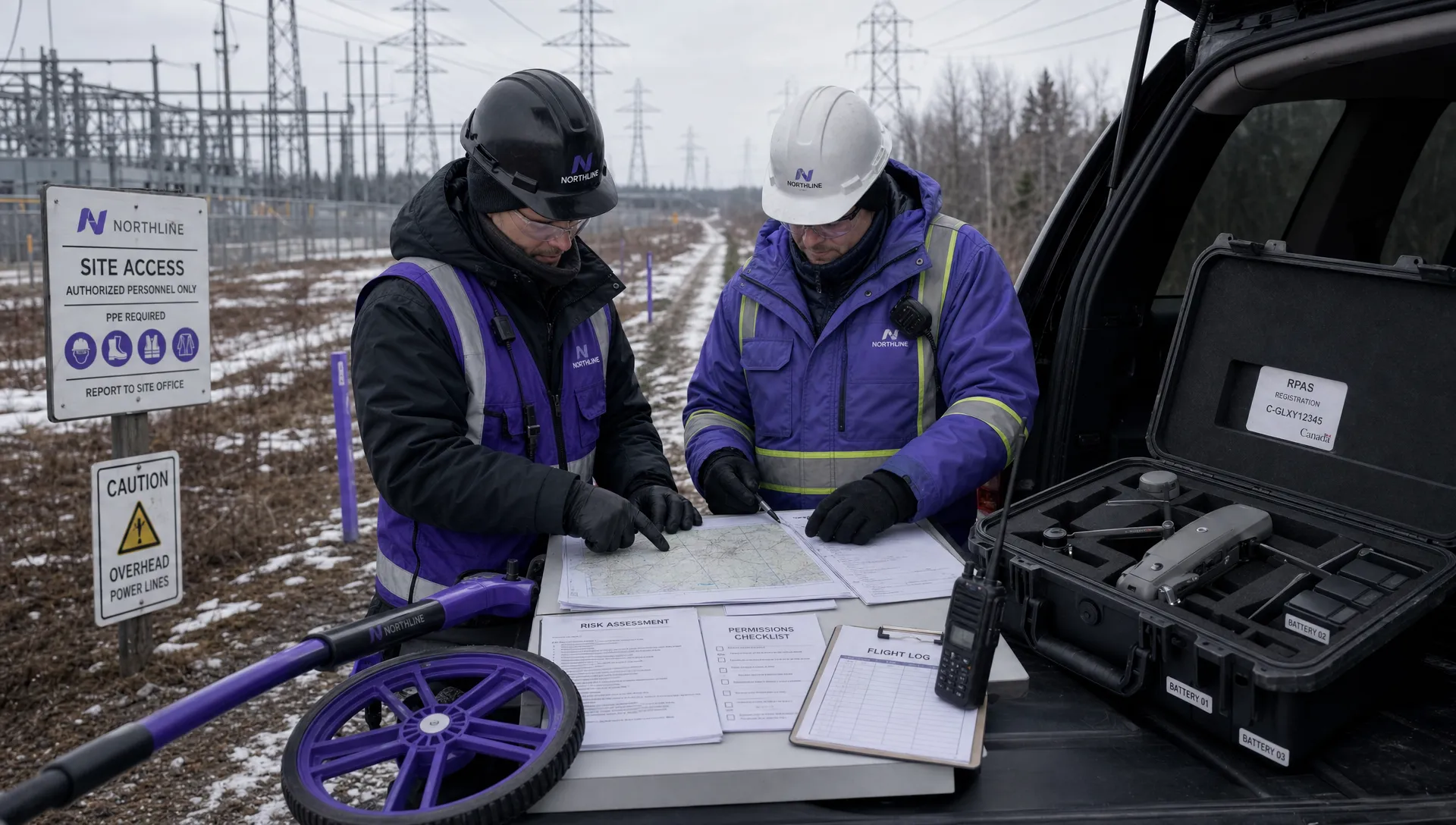 Canadian Drone Regulations Explained for Business Use →
 FAA Part 107 Drone License Explained for Beginners →